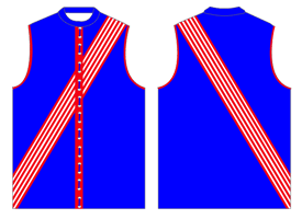
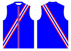
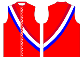
Probably, but it still looks quite good as you/I set it out.The Dutch "clash" strip.....
I didn't realise it but that's where I might have got the inspiration from.
- Footscray Not Western Bulldogs
- → Viewing Profile: Posts: StatsFanatic
Community Stats
- Group Members
- Active Posts 7
- Profile Views 7,680
- Member Title Wally Donald
- Age Age Unknown
- Birthday Birthday Unknown
-
Gender
 Not Telling
0
Neutral
Posts I've Made
In Topic: Changing the Footscray Guernsey
10 April 2010 - 02:02 AM
In Topic: Changing the Footscray Guernsey
10 April 2010 - 01:52 AM
Yea, and it kinda brings back the early year back in the VFA when Footscray had a few sashed designs...That's exactly what I've been thinking of!!
I reckon it'd look class.
1894

1896

1898

In Topic: New Footscray Football Club publication soon for release
10 April 2010 - 01:37 AM
I already have a copy of 'The History of the Footscray Football Club - Unleashed', it'd be great to get a more recent and updated history of the Bulldogs Heritage, if you can still call it that.
In Topic: Before the game- you are told you can take a 72 point win if you like?
10 April 2010 - 01:33 AM
I was actually kinda disappointed with Tigers kicking that late goal as:
1) Without it Bulldogs would of kept them scoreless for that final quarter,
and
2) Despite it being early in the season, that last goal pushed us from a possible 8th at the end of the round, down to 10th.
1) Without it Bulldogs would of kept them scoreless for that final quarter,
and
2) Despite it being early in the season, that last goal pushed us from a possible 8th at the end of the round, down to 10th.
In Topic: Changing the Footscray Guernsey
10 April 2010 - 01:21 AM
Son Of Scray - that is Class with a capital C!
That away jumper would be magnificent.
Alternatively, how about plain white with a red and blue sash (about the width of Essendon's). This, coupled with white short and white socks (with a red and blue stripe halfway up the socks), would look great.
Shame my graphic design skills are poor... I'll leave the image for someone else or your imagination.
So something like this?

- Footscray Not Western Bulldogs
- → Viewing Profile: Posts: StatsFanatic
- Privacy Policy


 Find content

